At Liverpool John Moores University, we’re committed to making digital content accessible to as many people as possible. This article is one in a series of accessibility tips to help you improve the digital environment for everyone. We would like you to adopt this tip as part of your practice.
In the UK around 4.5% of the population is colour blind or has a Colour Vision Deficiency (CVD) (colourblindawareness.org). Using colour in your content can impact a user’s ability to view this information in a number of ways:
- Using colour to convey information
- Colour Contrast
Avoid using colour to convey information
Using colour to convey information e.g. using red text to highlight important course related information can be problematic for individuals who are colour blind or have CVD because they cannot identify the urgency or importance of this text from colour alone. You must use phrasing in your text to emphasise its importance for example, use phrasing such as: Important Information, Crucial Information, Important, etc.
Sometimes people use colour to categorise information; the traffic light system is often used to highlight the importance of information using the colours red, amber and green (High, Medium, Low), or use red and green to signify a correct and incorrect response. Additionally, you may use colour to help aid navigation or link subjects. These techniques present barriers to individuals who are either blind or have CVD as they may not be able to see or distinguish between these colours.
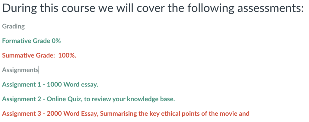
The below example uses a key to show which assessments are formative and which are summative. This would present a barrier to some students because they are unable to distinguish from this information which assignments are awarded a grade:

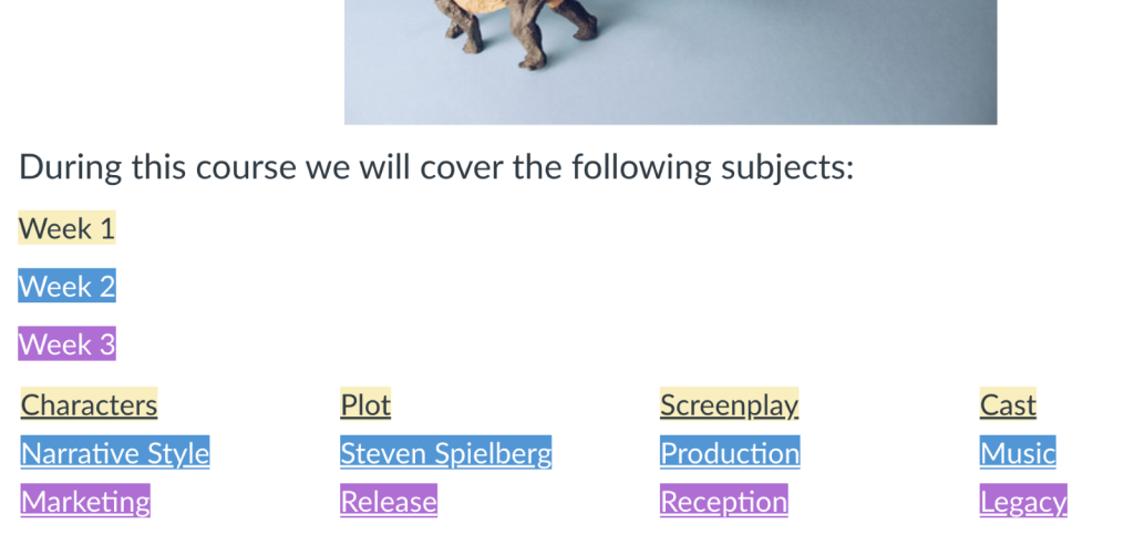
The following example is also problematic, it shows the weeks of study and links to further content about the material covered each week. There’s no way of mapping out which subject belongs to which week, other than by the colour coding:

Ensure that colour is not the only way of distinguishing information when adding content to Canvas. Embed these subtle characteristics into your text so that they are accessible to all users. In the first example, formative or summative could be added to the assignment text to ensure that students understand the context. In the second example, simply adding Week 1, before the week one subjects and then Week 2 before the week two subjects is an easy way to make this content more accessible. You might want to think about using Headings in your text to define sections and make the content easy to navigate too.
Colour Contrast
Content with low contrast can affect access for people with moderately low vision or impaired contrast perception, without the use of contrast-enhancing assistive technology. You should provide enough contrast between the colour of your text and its background to make it perceivable.
Text should have a minimum contrast of 4.5:1
OR
3:1 for text larger than 18pt.
The best thing to do is to keep your text standardised. Use a system’s default colour when creating new content. If you want to add colour to your design, ensure that it meets the minimum thresholds outlined above.
How do I find out what the colour ratio is?
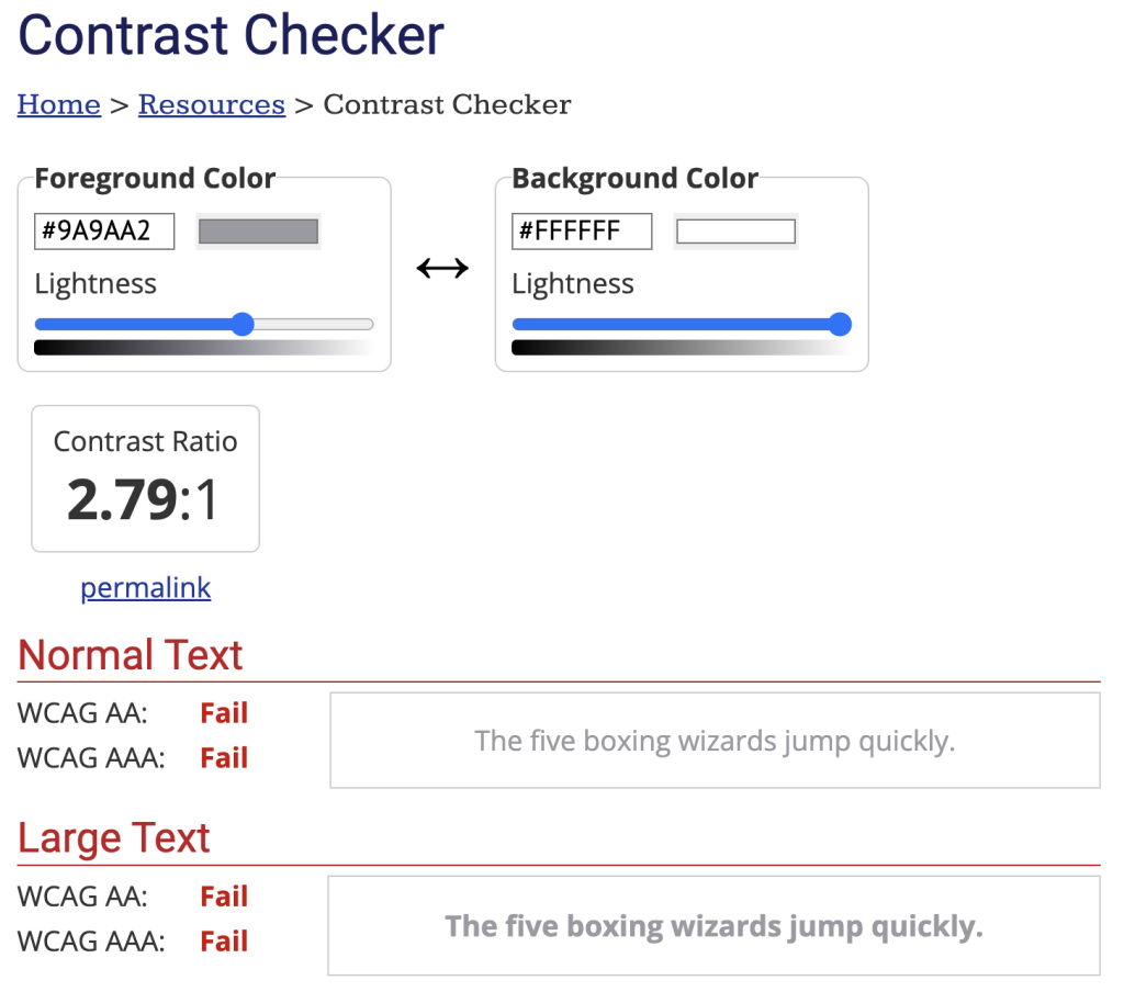
WebAIM have developed a colour checker, so that you can ensure that your text meets WCAG guidelines. If you know the colour code of your text you can insert it into the ‘foreground’ box, and then place the code for your background colour in the ‘background’ box. This will usually be white unless you have changed it.
WebAIM’s contrast checker shows the ratio of your colour, and whether it passes or fails for normal size text and large text. The panel on the right also shows how your text appears using these colours.

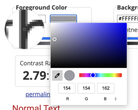
If you don’t know the colour codes used, you can also use the colour picker by accessing the colour box and then selecting the colour picker icon and selecting the colour of the text from your page or document. You can also do this with your background colour.
Tip: Have both the colour picker window and your content window open side by side to make it easier to select your colour.

Hopefully this blog post has given you some insight into the importance of how to use colour appropriately in your content and how this might impact on people with visual disabilities accessing your content.
Accessibility in Digital Education Design Project (AiDED)
The Teaching and Learning Academy’s AiDED vision is to use the digital learning environment to help all our students improve their life chances. Find out more about accessibility and the AiDED project over on our website: https://ltech.ljmu.ac.uk/?page_id=10752
