Blog Post: Accessibility – Just do one thing [1. Headings]
We’re committed to making digital content accessible to as many people as possible at Liverpool John Moores University. This article is one in a series of accessibility tips to help you improve the digital environment for everyone. We would like you to adopt these tips as part of your practice.
There are some simple steps you can take in Word documents or web pages like those in Canvas to make your content accessible and it makes it look great too!
People with dyspraxia or dyslexia find large sections of unbroken text difficult to read. People with visual impairments often use screen reader software to move efficiently through a document or webpage. Screen readers use headings and styles within a document or webpage to allow users to jump to different sections.
Every time a style is applied to a heading or subheading in your content it organises your document into sections that can be navigated by keyboard or screen readers and it also provides consistent formatting for all users.
How to Apply Headings
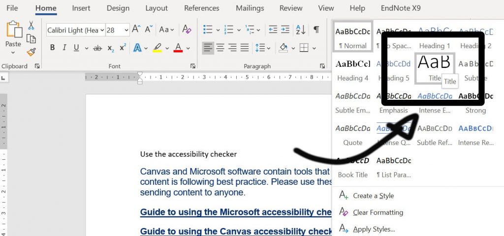
Start by highlighting the title text in your document or page and apply the ‘Title’ style. Then select your first heading and apply ‘Heading 1’ from the styles menu. Work your way down to subtitles or nested headings applying further styles as you go e.g.
> Document Title (Title Style)
> First Heading (Heading 1 Style)
> Subheading (Heading 2 Style)
> Subheading (Heading 3 Style)
> Second Heading (Heading 1 Style)
> Subheading (Heading 2 Style)
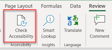
For more information about applying styles in your document, take a look at this Microsoft guide: Improving Heading Accessibility
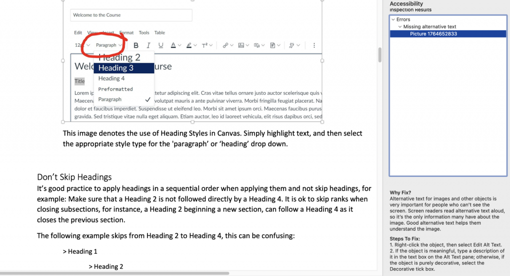
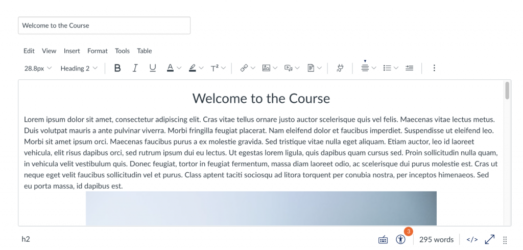
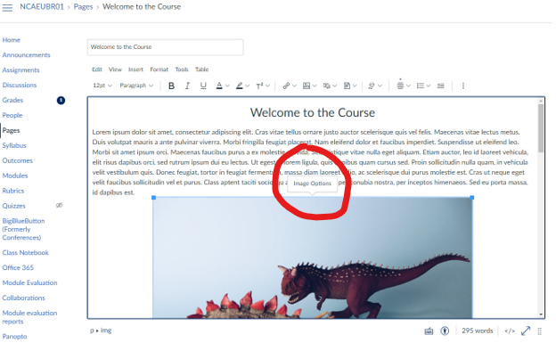
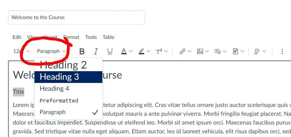
The same principle applies in Canvas, simply select your text and use the ‘paragraph’ box to select an appropriate heading:
Don’t Skip Headings
It’s good practice to apply headings in a sequential order when applying them and not skip headings, for example: Make sure that a Heading 2 is not followed directly by a Heading 4. It is ok to skip ranks when closing subsections, for instance, a Heading 2 beginning a new section, can follow a Heading 4 as it closes the previous section.
The following example skips from Heading 2 to Heading 4, this can be confusing:
> Heading 1
> Heading 2
> Heading 4
Headings should always be placed in sequential order, but it’s OK to skip ranks when closing a section. There should be a singular Heading 1 heading on your page, this should be your title, all other headings must be Heading 2 onwards:
> Heading 1
> Heading 2
> Heading 3
> Heading 2
Don’t make your own heading by bolding the text or enlarging the font. The code behind the inbuilt styles will not be available to screen readers and users will not be able to skip to this section.
Accessibility in Digital Education Design Project (AiDED)
The Teaching and Learning Academy’s AiDED vision is to use the digital learning environment to help all our students improve their life chances. Find out more about accessibility and the AiDED project over on our AiDED Project page.