This guide will help you to understand how to design and create an infographic and also support students to create their own.
What is an infographic?
An infographic is a collective term for an image that uses a mixture of text, graphs, and pictures. The design is very concise and direct so that you can read and understand it in seconds.
“to persuade, entertain and inform the audience and also obtaining the readers’ attraction, hence, the readers can distinguish why they need to read the infographic” (Krum, 2013)
The concept has developed as part of social media over the past 10 years. However, some relate it back the development of data graphs such as those made by Florence Nightingale or Charles Joseph Minard
It requires the designer to be very clear about what they want to communicate. It also needs the designer to be inventive in order to capture the essence of the information in an eye-catching way. This is so that it captures the viewer's attention as well as communicates the idea.
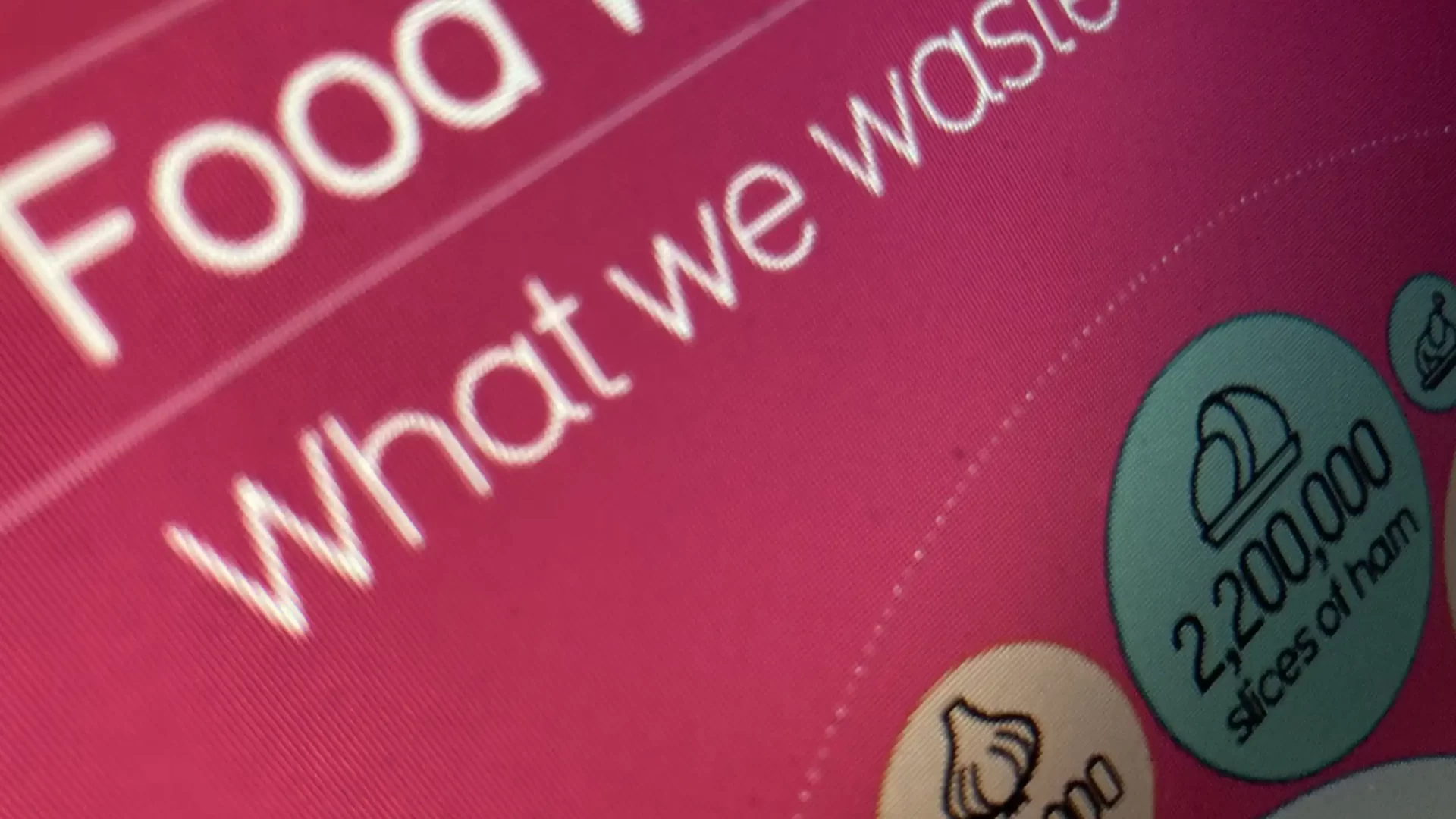
Here are some examples of infographics
Why might I want to create one?
- As part of your research: Research is as much about impact as it is about finding out new things. Your findings can reach a wider audience through different communication methods. Knowing how to use visual language effectively can help share your findings. It may also help develop your career.
- As part of your teaching materials: Obviously, clear and concise representations of complex ideas can help students begin to develop a deeper understanding of your subject. It can create a foothold for students who may be struggling with key concepts. A good infographic may also reveal something unexpected within the data.
- As part of your student coursework submission: An infographic could be a method for students to demonstrate their learning. Designing an infographic requires many different skills. Sorting, organising, filtering, and communicating information to a wider audience. Although it is related to a poster presentation, it is arguably more concise and for a different audience that can motivate students to think beyond communicating their understanding to just you.
What research is there that creating infographics improves the student learning experience?
Research into infographics and student learning is still in its infancy. However, there are some implications for practice that could be useful.
General research around different assessment formats
There are a number of claims that diversifying the assessment formats across a programme can help our diverse students through different forms of representing knowledge. A review of a recent project at University College Dublin (UCD) by O’Neill and Padden (2021) highlights a number of issues and possible solutions.
- Be clear and transparent: Students and staff may be resistant to this change. It will be unfamiliar to them, causing additional stress, and reducing performance, make sure they understand the reasons and possible benefits.
- International students: These students a particularly at risk from the introduction of different and unfamiliar assessment types.
- Too much diversification: Students who are unfamiliar with a particular assessment type will benefit if it is repeated during the programme. This will allow them to develop the skills and understanding without an over-concentration on novel aspects of the assessment process.
You can read about 'A Practitioner's Guide to choice of assessment methods within a module'
Universal Design for Learning is a pedagogical approach designed to support student diversity. One of its three key principles is diversification of assessment to allow students to express their understanding in different forms.
Infographics Research
- Key skills: Shanks et al (2017) see infographics as an excellent opportunity for students to develop skills in information literacy, communication science, and data visualization.
- Visual literacy: Nuhoğlu Kibar and Akkoyunlu (2014) highlight the importance of practicing and developing skills in visual literacy. They see this as just as important as verbal and written literacies. They define it as ‘A group of acquired competencies for interpreting and composing visible messages’ Visual literacy allows a deeper interaction with messages of all kinds and introduces the process of analytical thinking about representation and meaning.
- Picture Superiority Effect: Infographics have been connected with the psychological perception theory of ‘picture superiority’ (Naparin and Binti Saad, 2017). This effect suggests that there is primacy towards the perception and memorisation of images over other types of information. This theory is still contested, but it may be a useful way of encouraging students to think about creating infographics.
- Practicing your skills: Shanks et al (2017) suggest encouraging experimentation with simple example data to start with. This is to allow students time to play with the technology and the idea of data visualisation.
How do I design one?
- Get ready: Do not start your design until you have gathered your information. Research your topic in depth to understand all the different aspects. Then identify the important parts of this information that you want to highlight. Remember you are trying to find the key messages. Use a process like mind-mapping to help you do this. Edit and summarise the information. Watch the following video about how Charli has approached visualising her music listening habits for 2015. Designing a music infographic | CharliMarieTV.
- Visual Language skills: Charli demonstrated in the video how she wireframed her design. Use the same process to think about any visuals you might use to help communicate. David McCandless is a famous data visualisation expert. In this video, he talks about how he makes his decisions on how to represent data. Think about the different ways you could communicate your key messages. David McCandless Ted talk called the beauty of data visualization by David McCandless. A good design needs an element that makes it stand out and catch the eye. This is very difficult to teach someone. However, try different designs and remain open to creative ways to get your message across.
- Accessibility: As a visual designer you need to be careful of the different needs of your audience.
- Colour contrast: Many people have a visual disability connected with colour vision deficiency (CVD) or colour An infographic can be hard to read if there is low colour contrast between text and background colour. Use the WebAIM contrast checker to help you to measure colour contrast.
- Alternative text: Some people need a text alternative because their visual impairment will prevent them from reading your infographic. Prepare a text alternative that you can share along with the infographic on the web or in a document. Here is a guide on ALT text by Microsoft
How do I make one?
Adobe Express: LJMU has accounts for the online software, Adobe Express. You can use this tool to create your final design.
- Go to Adobe Express
- Click on ‘Sign in’
- Click ‘login with school account’
- Use your username @ ljmu.ac.uk and your LJMU password
This video gives you a quick overview of the interface Getting started in one minute with Creative Cloud Express
Here is a simple video to get you started to Make Simple Infographics in Adobe Express in 5 minutes
Adobe Express comes with more guides and videos
How do I teach a student to make one?
Adobe have created a short course for educators creating infographics using adobe express. Claudio Zavala Jr. shows you how to create infographics in your classroom with Adobe Express in 4 sections taking 2 hours in total. Sign in using your username @ ljmu.ac.uk and your LJMU password.
References
Naparin, H. and Binti Saad, A. (2017) ‘Infographics In Education: Review on Infographics Design’, The International journal of Multimedia & Its Applications, 9(4/5/6), pp. 15–24.
Nuhoğlu Kibar, P. and Akkoyunlu, B. (2014) ‘A New Approach to Equip Students with Visual Literacy Skills: Use of Infographics in Education’, in S. Kurbanoğlu et al. (eds) Information Literacy. Lifelong Learning and Digital Citizenship in the 21st Century. Cham: Springer International Publishing (Communications in Computer and Information Science), pp. 456–465.
O’Neill, G. and Padden, L. (2021) ‘Diversifying assessment methods: Barriers, benefits and enablers’, Innovations in Education and Teaching International, 0(0), pp. 1–12.
Shanks, J.D. et al. (2017) ‘Teaching Undergraduate Students to Visualize and Communicate Public Health Data with Infographics’, Frontiers in Public Health, 5.