The Canvas Enhanced Analytics Dashboard allows Academic Staff to view student engagement with Active Blended Learning Tasks in relation to other students on their programme. This Can help staff to identify those students who may be be participating in the course as much as they should and could also be a valuable tool in identifying how student engagement could be enhanced with respect their own learning materials.
In addition to this guidance please see Canvas Enhanced Analytics Project for more information. Details of how to use Canvas grades to evaluate engagement with tasks can be found at our Staff Guide: Analytics and Canvas grades to enhance engagement and to book on to a session to learn more about Active Blended Learning and analytics.
Who will benefit from using the dashboard?
The Dashboard is targeted at academic staff to view engagement with online activities on their courses. It is for all academic staff, programme leaders and school directors will also be able to use it to aggregate school level activity data.
What does the dashboard measure?
There are widely acknowledged limitations when it comes to simply using ‘click’ data in order to establish student engagement with online learning. A student can click through to a document though may not read the content, or might open a video and leave it playing in the background, not necessarily paying much attention. A more effective measure of engagement is to combine content and learning materials with tasks that establish engagement and deomstrate a degree of understanding. This has been a feature of all of Active Blended Learning development that the Teaching and Learning Academy have put in place over the past six months.
To support that approach this dashboard combines all student activity in relation to Quizzes, Discussion boards and submissions and presents these on a graph. Illustratting where each student is in relation to the rest of their peers on their programme.
How is the Data managed
The data comes from Canvas Data and Staff and student records. It uses school memebership to ensure staff only see the data most relevant to them and is presently available to academic staff members only. The data for the report refreshes on a daily basis. Additional views for other members of staff can be considered where appropriate. Please raise a helpdesk ticket and FAO the Technology Enahanced Learning Team
How to navigate the Dashboard
The Dashboard Can Be Accessed in Canvas Via “Account>Enhanced Canvas Analytics
It can also be accessed directly (if prompted to sign in use your username @ ljmu.ac.uk and password, same as Canvas).
The Dashboard has three components.
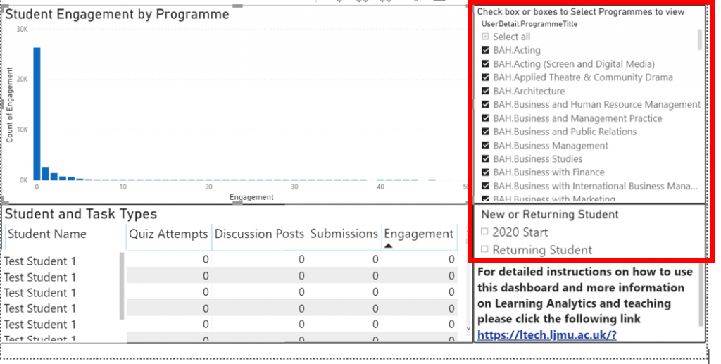
- Filter by New/Existing Student and Programme
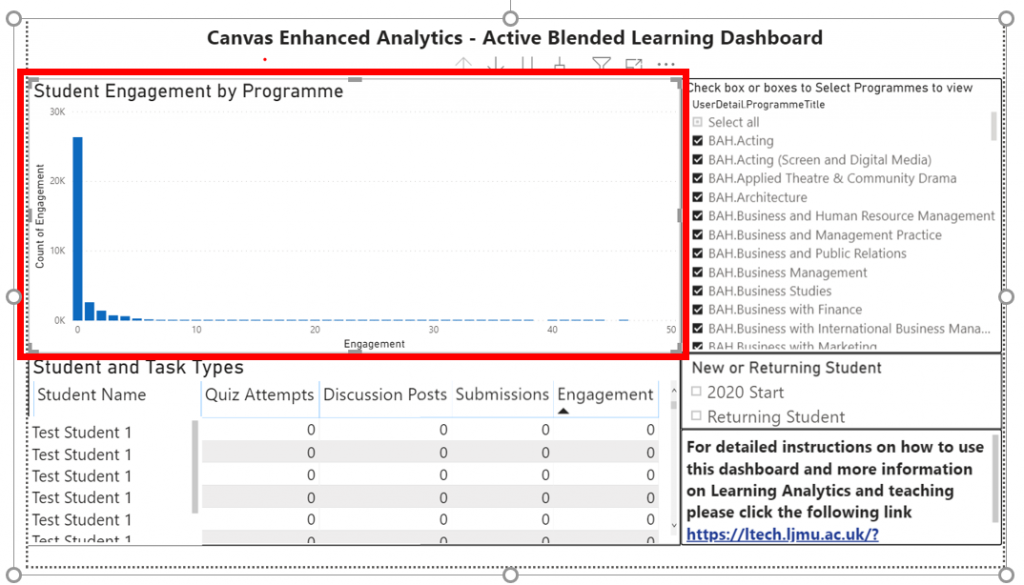
- The Graph “Student Engagement by Programme”
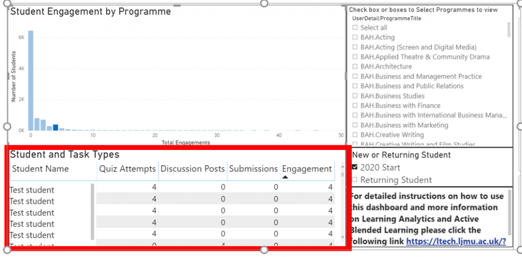
- The “Student and Task Type” Table
Filter By Programme and New Student
When you access Canvas Enhanced Analytics, the report will identify your school from your login and present the approrpiate data to you. You can select one or more relevant programmes using the check boxes on the dashboard. Illustrated below.
You will then also be able to identify new students or returning students by checking as these might show different engament trends for the first weeks of teaching.
As you filter using checkboxes you will notice the graph on the right hand of the interface begin to change. This graph details the number of engagements (Quizzes taken, discussion posts and submissions) along the bottom (x-axis) The further to the right, the greater the number of engagements.
The y-axis (left hand side) shows the number of students who have taken part in that many activities. The higher this bar the more students. As the graph below has a high bar on the left this means a lot of students have yet to engage (expected given this is the start of the year)
When selecting one of the bars in the graph, the report will filter down to all students who presently have that total number of engagements within Canvas. The student name will appear alongside a breakdown of their activity.
This allows staff to filter students by their engagement with Active Blended Learning Tasks in Canvas. The daily refresh of the data will hopefully begin to illustrate engagement trends and students to the left of the graph (ie those with lower engagement with the activities relative to their peers) can be identified and appropriate courses of action decided
Please note the dashboard does not automate or process any data beyond visualisation and aggregation. It will not send out notifications and leaves the threshold for any intervention to the judgement of the respective teaching teams.
If you have any questions, or would like to become more involved in the development of Analytics at LJMU please contact Phil Rothwell by email p.b.rothwell@ljmu.ac.uk at the Teaching and Learning Academy.